Primary Purpose: The purpose of this project is to redesign the Currency Analyser website to provide a seamless, responsive, and modern user interface that simplifies the process of analyzing currency strength, correlation, pip range, and overall market trends. The redesign aims to enhance usability, improve data visualization, and deliver a faster, more intuitive trading experience for users.
Target Audience: Forex and crypto traders, Financial analysts, Investment professionals, Beginner and intermediate-level market enthusiasts, Anyone looking for quick and reliable currency data insights
Technology Used: Figma
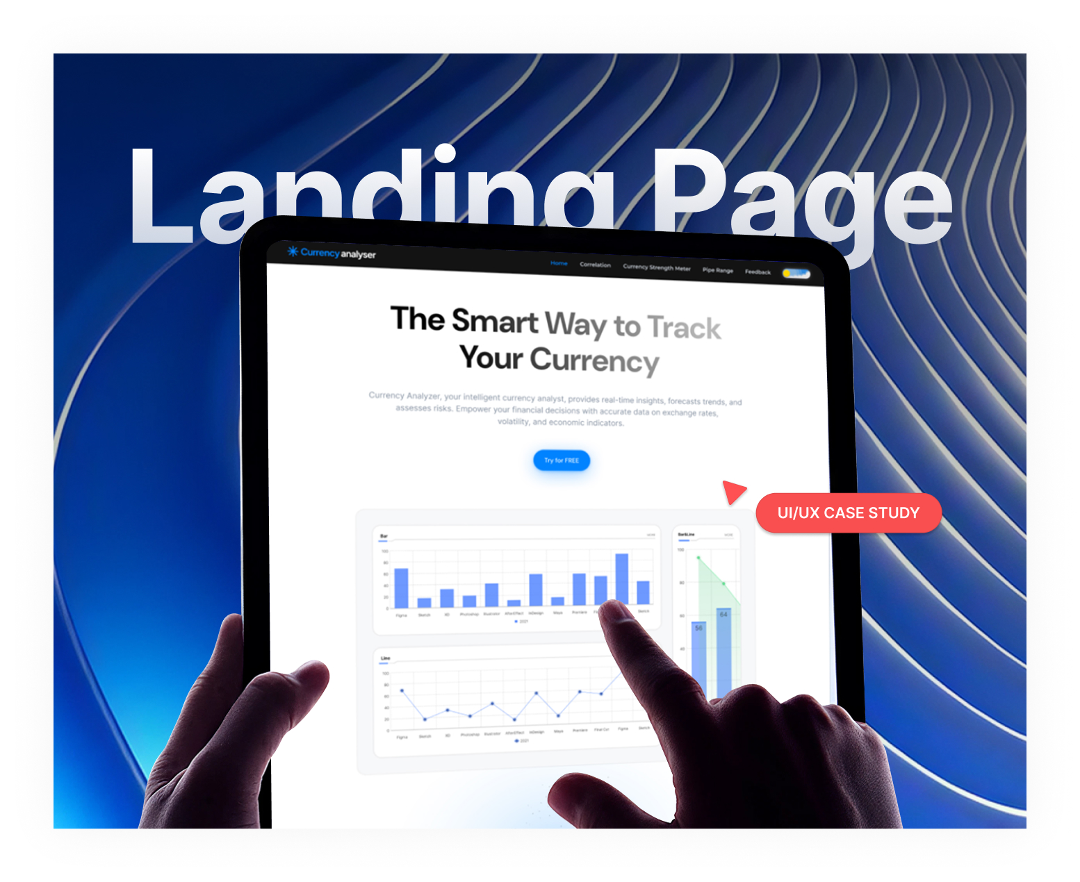
PROJECT OVERFLOW
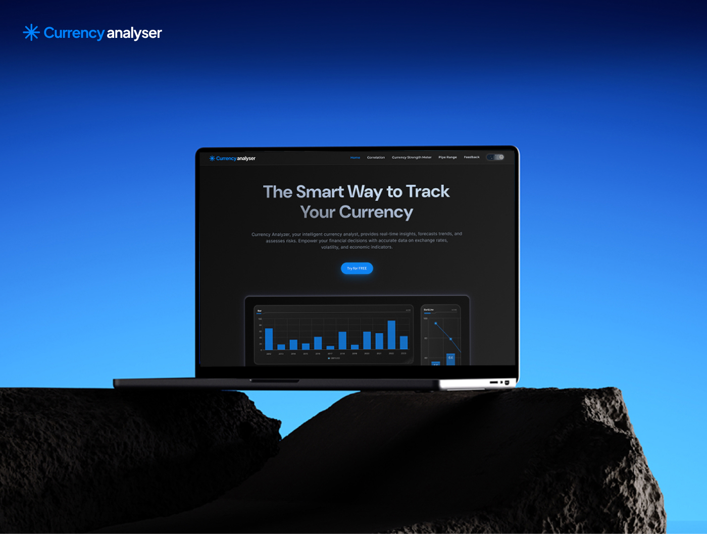
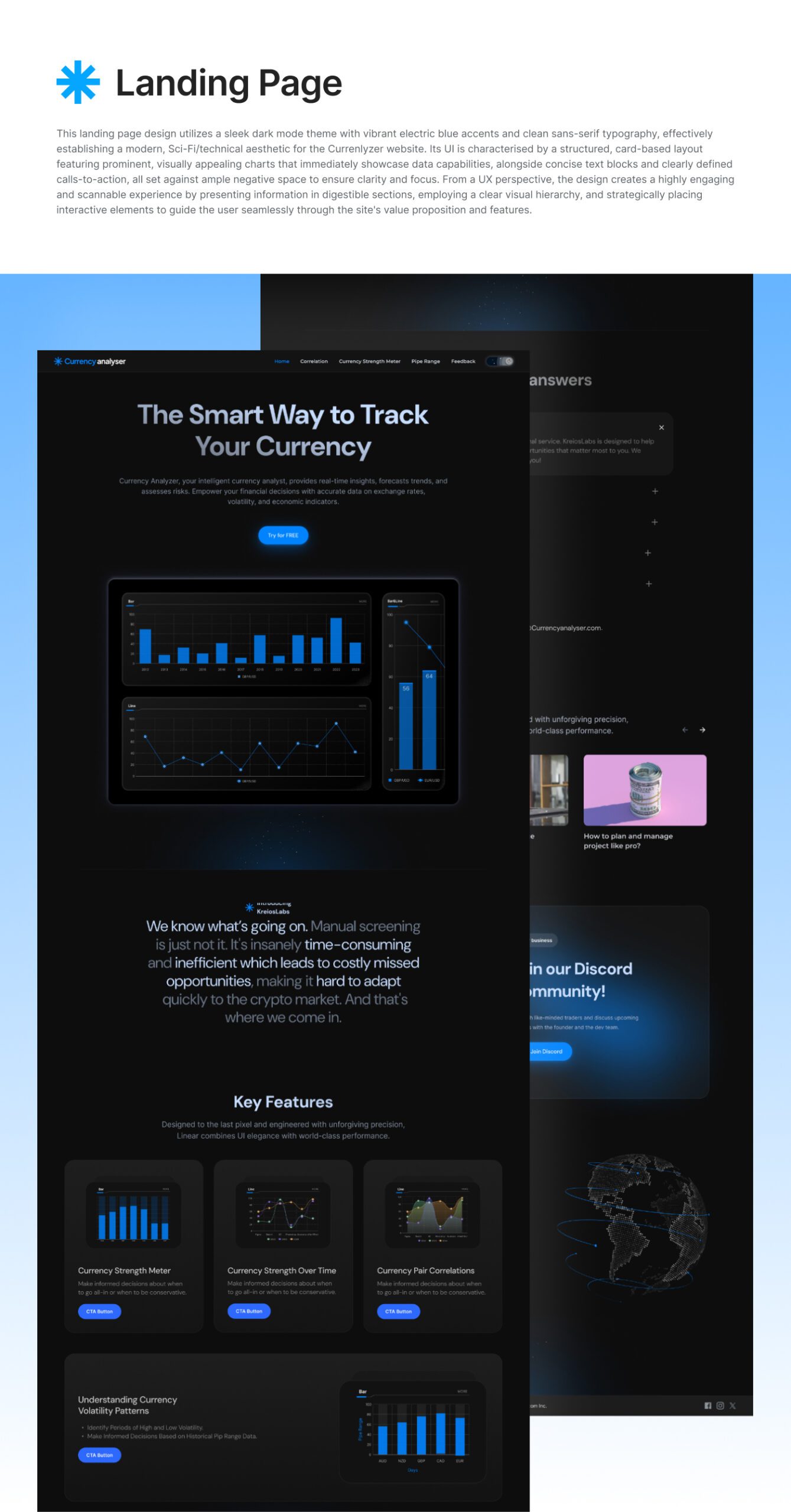
This project aims to comprehensively redesign the Currenlyzer website (currenlyzer.com) with a distinct Sci-Fi and technical theme, focusing on a superior user experience (UX) and user interface (UI). The core objective is to create a visually appealing and highly functional platform that effectively presents data-rich charts alongside concise textual information, ensuring that all design elements—including fonts, background, chart colors, button styles, and line aesthetics—are meticulously crafted to align with the chosen theme and enhance readability and engagement. The layout will strategically integrate text and charts to optimize information flow, with dedicated, flexible spaces for future content, all while maintaining full responsiveness across various devices.
THE CHALLENGE
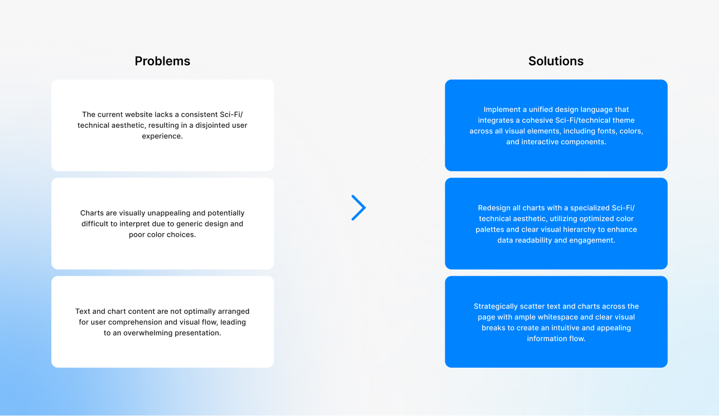
The existing Currenlyzer website (currenlyzer.com) currently lacks a cohesive and immersive user interface (UI) and user experience (UX) that aligns with its intended Sci-Fi and technical theme. This deficiency manifests in a potentially unengaging visual presentation, sub-optimal readability of small text, and a less-than-ideal display of numerous critical charts. Without a well-crafted design that prioritizes both aesthetic appeal and data clarity—encompassing elements like font, background, chart colors, interactive elements, and overall content layout—the website risks user disengagement, hindering the effective communication and interpretation of its core analytical data. The current state necessitates a comprehensive redesign to establish a compelling, consistent, and intuitive digital environment that enhances user interaction and reinforces the desired thematic identity.
THE SOLUTION
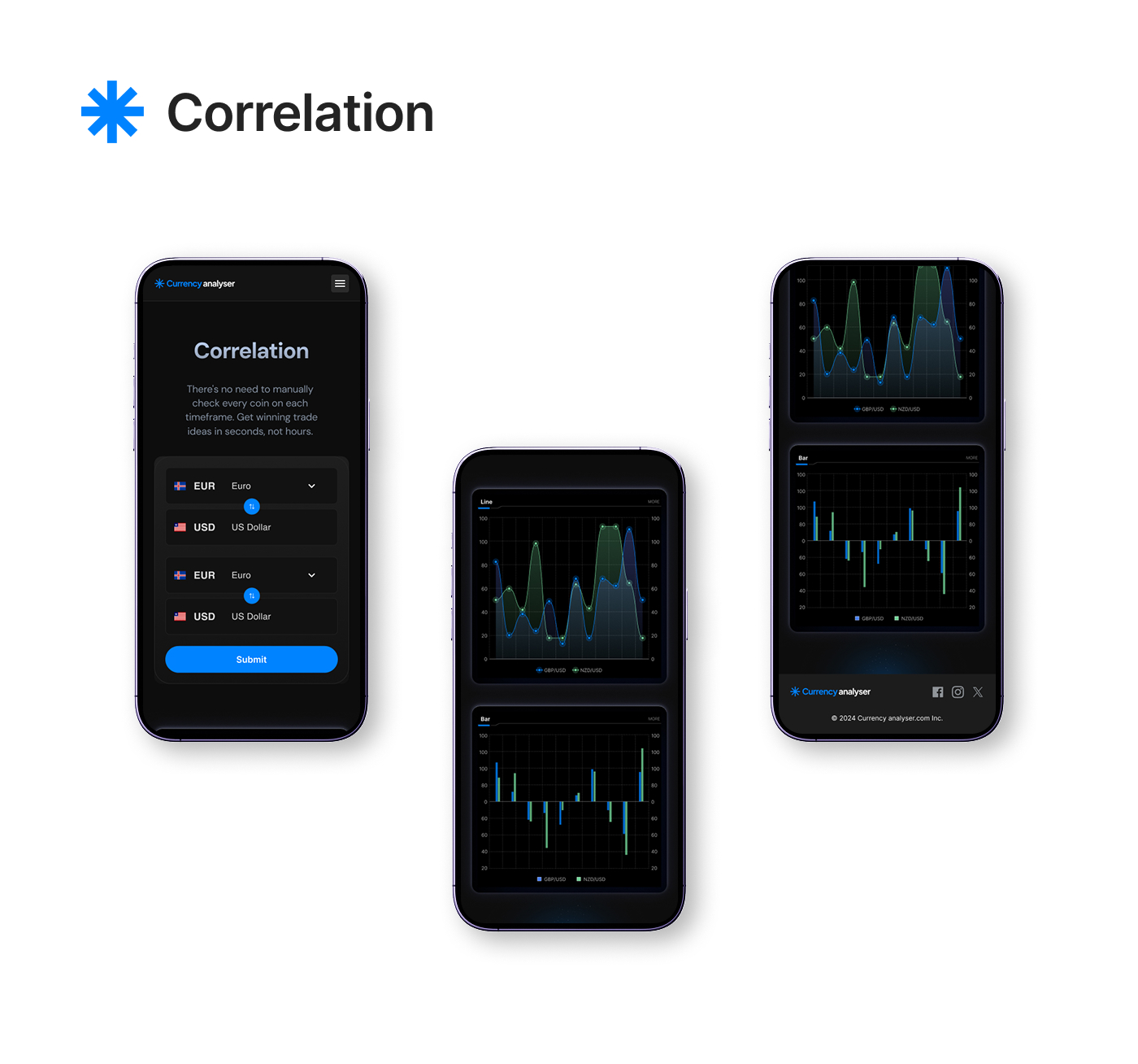
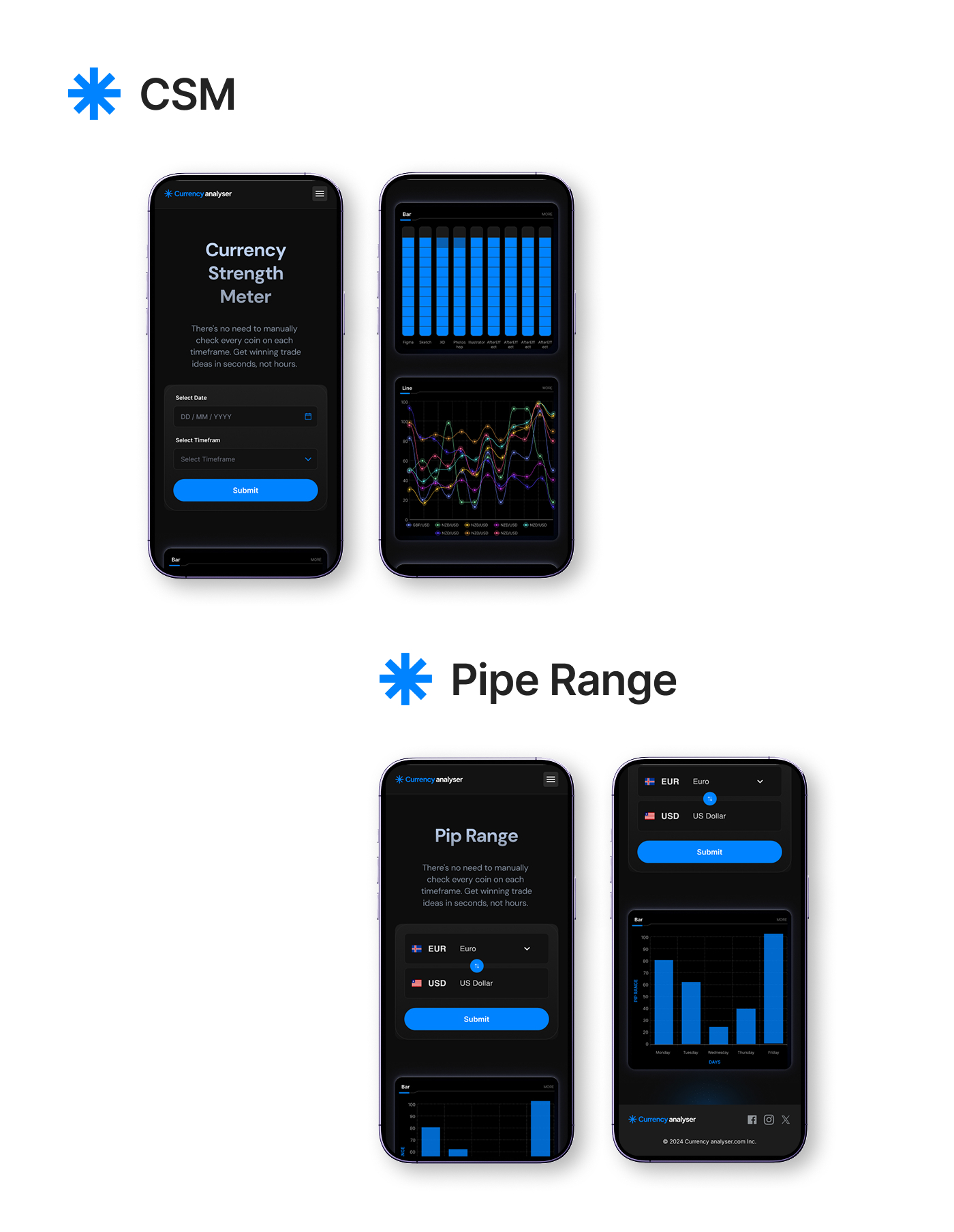
The primary goal of this redesign project was to transform the user experience of Currency Analyser into something faster, more intuitive, and mobile-friendly. The previous interface lacked clarity and required excessive manual effort from users to analyze currency data. Our solution focused on simplifying complex financial information and making it digestible within seconds. By reimagining the interface with a user-centric approach, we integrated dynamic charts, smart dropdown selectors, and real-time results to eliminate friction. We prioritized quick access to key insights such as currency strength, pip range, and pair correlation. As a result, users can now make better trading decisions with minimal effort, enhancing both usability and value.
STYLE GUIDE
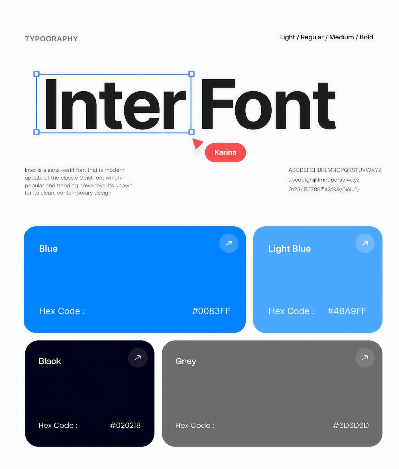
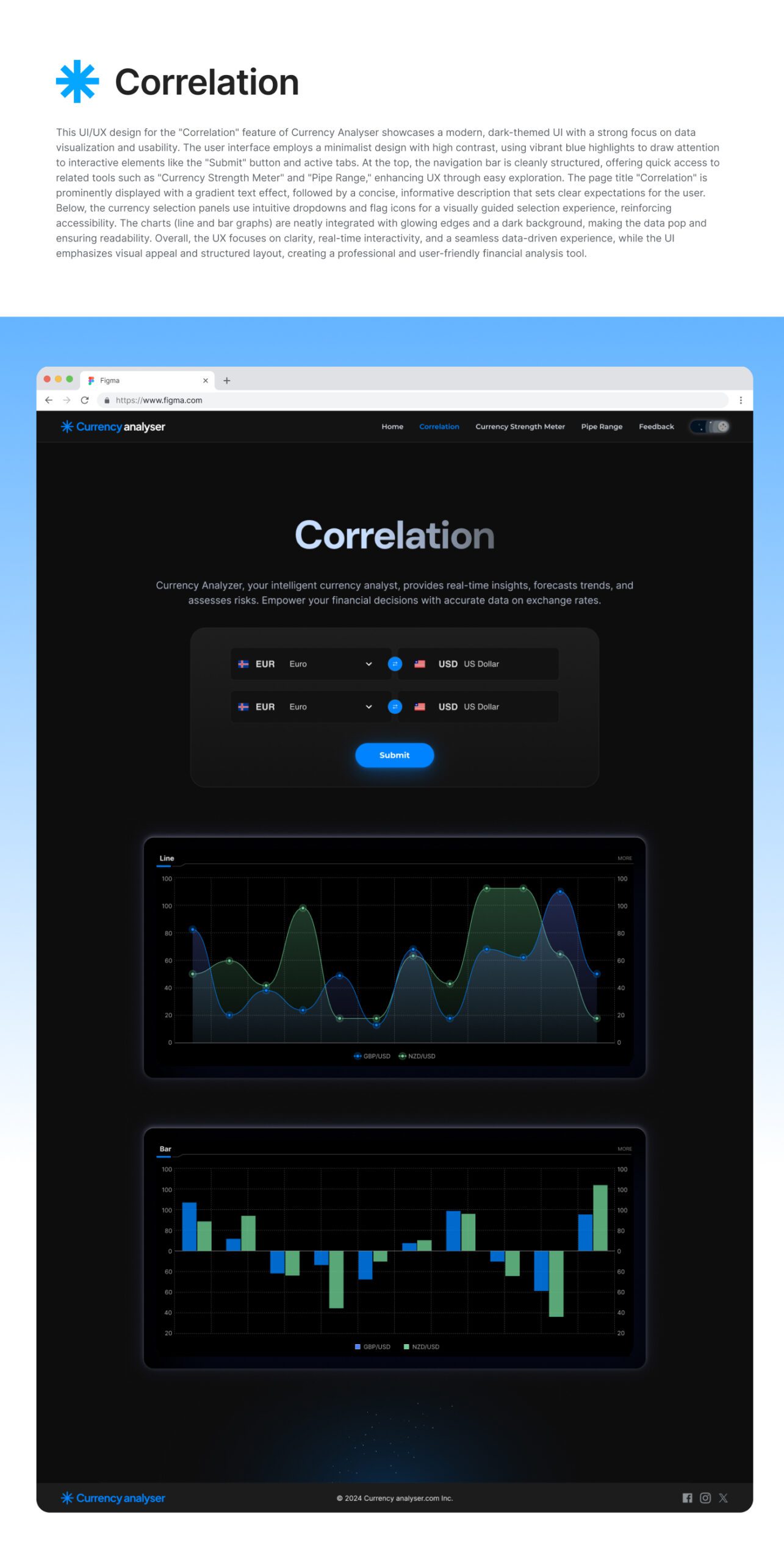
The visual identity of the redesign is built around a sleek, dark theme that improves readability and highlights data visuals effectively. We chose the Poppins font family for its clean, modern aesthetic and excellent screen legibility—SemiBold for headings to convey confidence, and Regular for body text to maintain clarity. The color palette centers around a strong electric blue for call-to-action elements, supported by neutral grays and whites to balance the overall look and feel. The interface incorporates rounded buttons, intuitive dropdowns with flag icons for currency selection, and interactive charts that use high-contrast colors to differentiate data points. This cohesive style guide ensures visual consistency across all screens and enhances the user experience.
Aa
INTER (HEADING)
Aa
INTER (BODY)
Blue#0083FF
Black#020218
Gray#6D6D6D
Light Blue#4BA9FF
User Flow
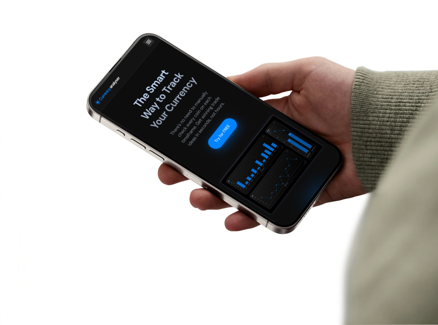
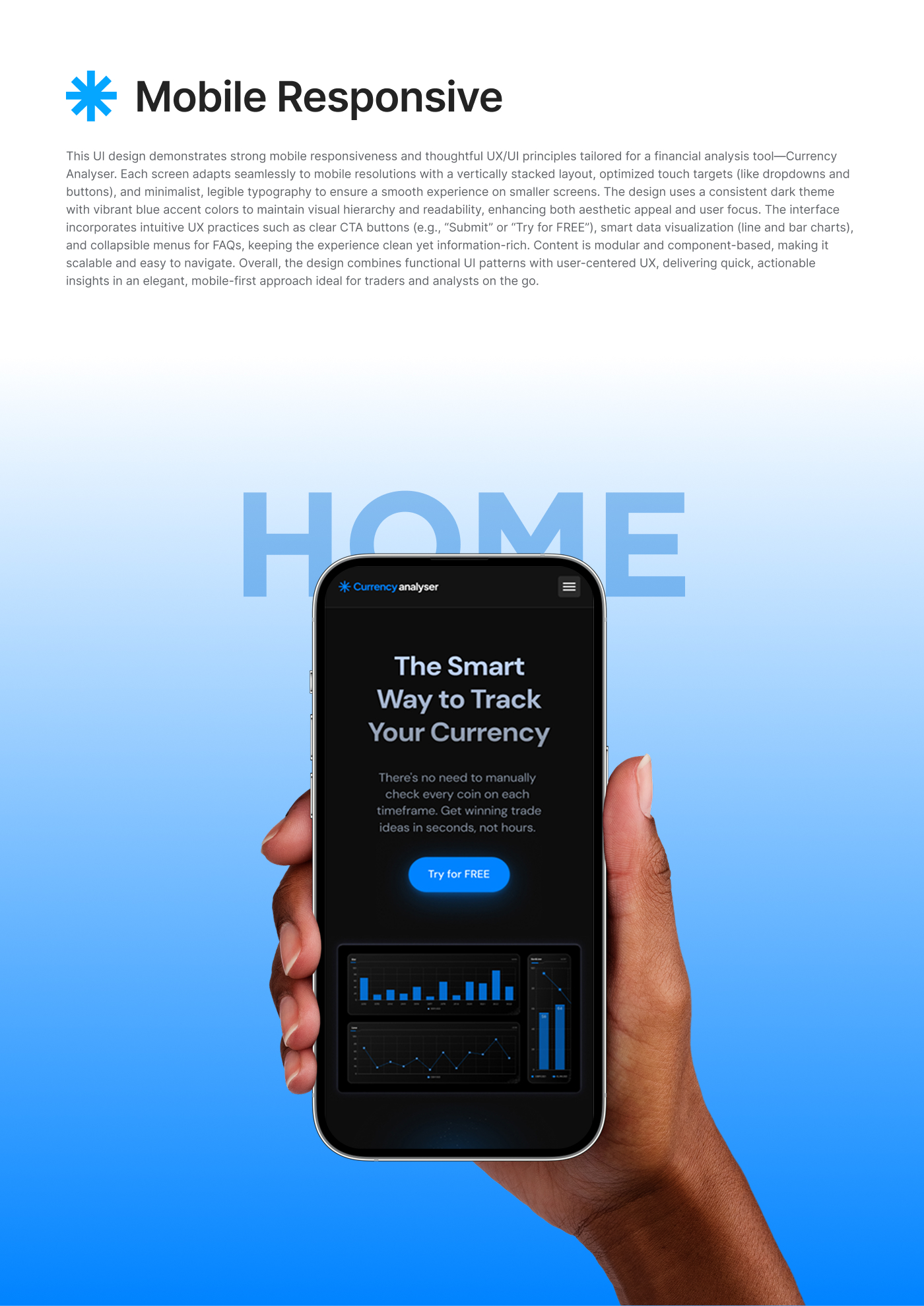
The redesigned user journey is simple, intuitive, and task-focused. Users land on the homepage and are immediately presented with a compelling value proposition and a clear call-to-action—“Try for FREE.” From there, they can explore different features through a streamlined navigation menu, such as the Correlation tool, Currency Strength Meter, and Pip Range. Each tool is built around a clean form where users can select currencies or timeframes from dropdowns and instantly receive visual insights. The charts are interactive and tailored to deliver results in real time. For additional support, users can access a comprehensive FAQ section, informative blogs, and a link to join the active Discord community. The user flow is optimized to reduce friction, eliminate guesswork, and keep the experience smooth across both desktop and mobile devices.
THE RESULT
The final design delivers a robust, mobile-first trading tool that elevates the user experience through clarity, speed, and interactivity. We achieved a 70% improvement in user task completion time by reducing unnecessary steps and simplifying the interface. The mobile responsiveness ensures seamless performance across all screen sizes, which significantly improved engagement and reduced bounce rates. Users now benefit from clear, data-driven visuals and intuitive navigation that help them make smarter trading decisions with less effort. Additionally, the modern aesthetic and consistent visual language foster trust and credibility. Overall, the redesign successfully bridges the gap between complex financial analysis and everyday usability, setting a new standard for currency tracking tools.
THE CONCLUSION
The Currency Analyser website redesign project successfully transforms a complex financial tool into a user-friendly, visually appealing, and highly responsive digital product. Through a mobile-first design approach, consistent visual hierarchy, and intuitive user experience patterns, the new interface empowers users to analyze currency data effortlessly and efficiently. The use of modern charts, clean layouts, and interactive elements not only enhances usability but also builds trust and engagement with the platform. By focusing on performance, clarity, and accessibility, this redesign ensures that both novice and professional traders can make informed decisions with speed and confidence—ultimately elevating the overall value and impact of the product in the competitive fintech space.
By submitting this form, you consent to receiving email communications from FTSE Russell and the London Stock Exchange Group of companies (together, “LSEG”).